Widget types
Widgets are used within dashboards in order to display different data points. You can choose which widget to use for each data point in order to best visualize the data you're displaying. For example, if you’d like to show numeric proportions you may use a pie chart, while if you’d like to show many specific details you may prefer a table.
Many of the fields used to set up widgets are shared, such as the Data Type and Chart Title fields. There are also some individual settings which only apply to certain widget types. Below the first section will explain all the general widget settings, and will be followed by individual sections with explanations for the use and setup of each widget type.
Widget setup
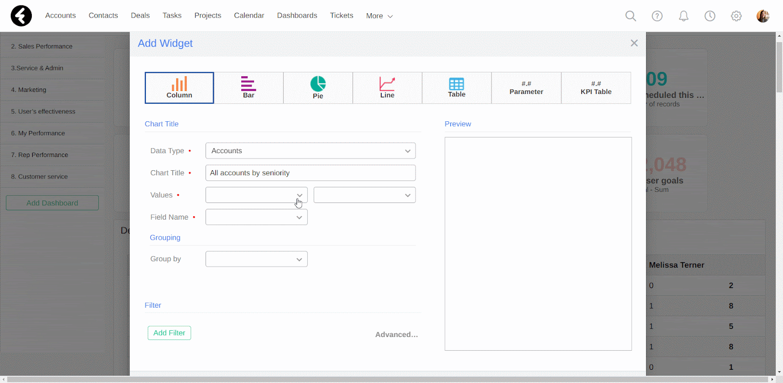
To add a new widget, first open the dashboard you’d like to add the widget to and then click the green Add Widget button. This will open the Add Widget pop up, where you can set up your new widget. The first step is selecting the type of widget you’d like to create. Read over the sections below to understand which type of widget best fits your data. Then click on the widget type you’d like to create. You can now start setting your widget’s details, which are explained below. If you see additional or different options for your widget which are not explained here, check out the explanation below for the specific widget type you’re creating.
Data Type
This option provides a dropdown list of all the objects in your system. Search for and select the object you’d like to display data from. For example, you can search for and select the Accounts object to display data about your accounts.
Chart Title
This sets the name of your widget, which will be displayed above the widget. By providing a relevant name which describes what data is being displayed, you’ll create an easily understandable dashboard.

Values
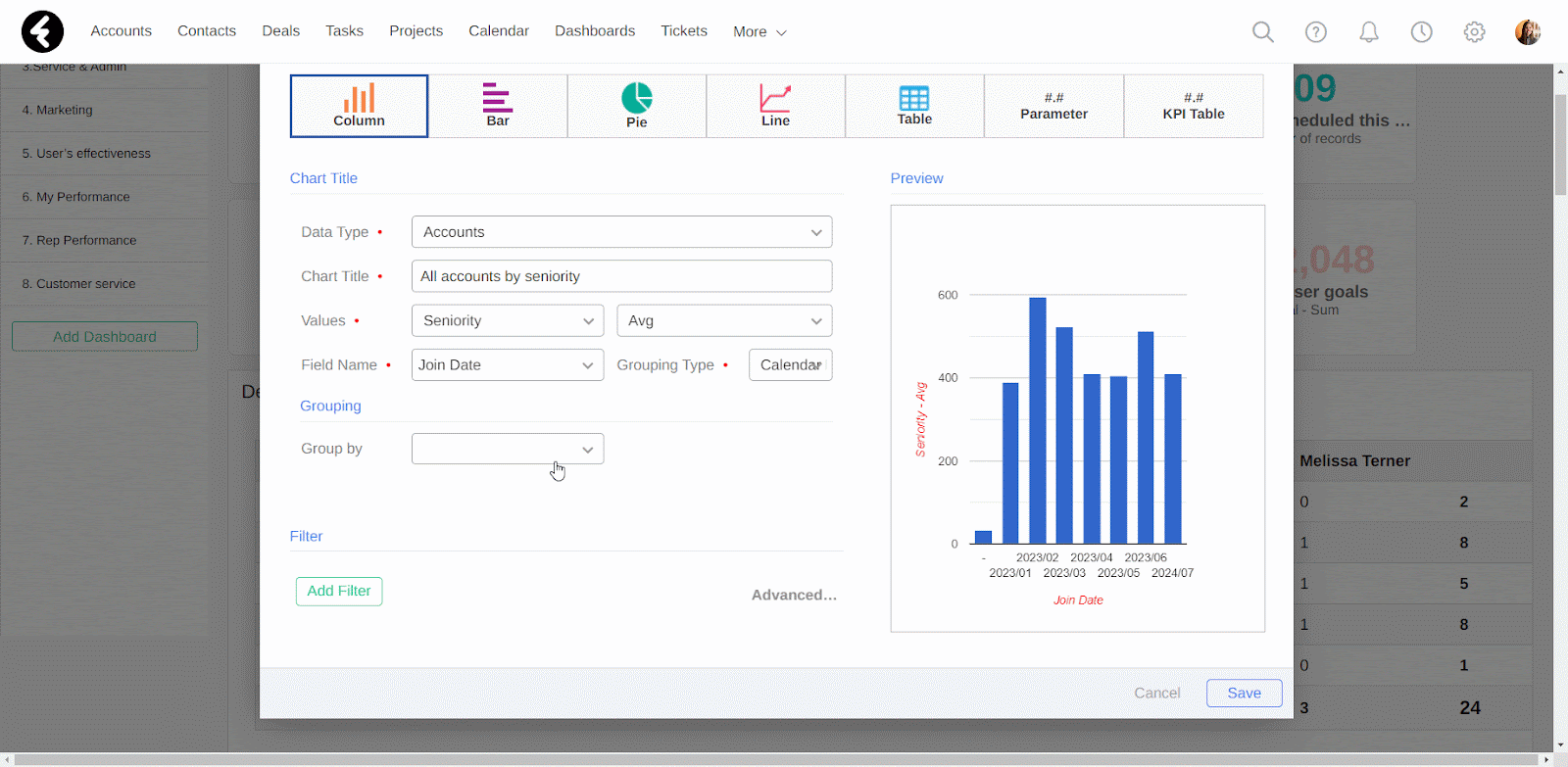
There are two sections here, which will set the exact data displayed in your widget. The first is a dropdown with the Number of records option, followed by a list of all the number fields which exist in the object you selected above. The second is a dropdown list where you can choose which value from the number field you first selected should be displayed. You can choose between the Sum, Avg, Maximum, Minimum, Percent, and Sum (Percent) options. For example, if you select the Seniority field and then the Avg option, the values used within your widget will be the average seniority of your accounts.
Field Names
Here you’ll find a searchable list of all the fields in the object you selected. The field you choose here will be the field which the widget is segmented by. If you select a date or date & time field, the Grouping Type option will open on the right. This lets you set the time frame you’d like to segment your values by. For example, if you select the Join Date field and then select Calendar Month, your data will be segmented by the month of their join date.
Group by
For some of the widgets you can choose to group the data by a specific field. This adds an extra layer of information to your widget. Simply select a field from the searchable dropdown list. Below you’ll find explanations on how this is displayed in each widget type.
Filter
You can use a filter to set which records will be included in the data you're displaying. For example, you can add the filter Status Equals Open to a tickets widget to only include ticket records where their status is set to open. You may use this option in a column widget which displays the number of open tickets segmented by their owner. Filters are used in many places throughout the system, you can learn how to use them in detail here. The Meet any of the following conditions option can be opened in this section by clicking the Advanced… option.
Preview
Here you’ll find a preview of the widget you’re creating. The preview will only pop up once you put in the required data and will update as you switch fields or widget types. This is a great way to check if the widget type you’ve selected is the ideal way for your data to be displayed.
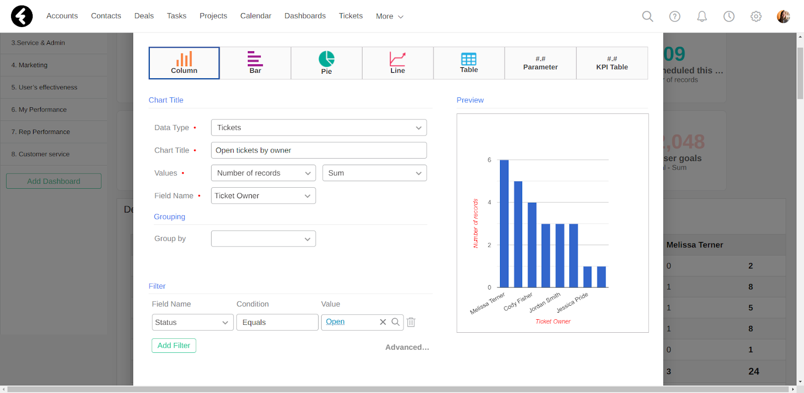
Column widget
The column widget is used to organize data in columns. The X axis will show the values of the field selected under Field Name, while the Y axis will display the selected Values.
When to use
Use the column widget to show a distribution of data points or perform a comparison of different values across different subgroups of your data. By using columns, you’ll be able to easily tell which groups are highest or most common, and how other groups compare.
How to use
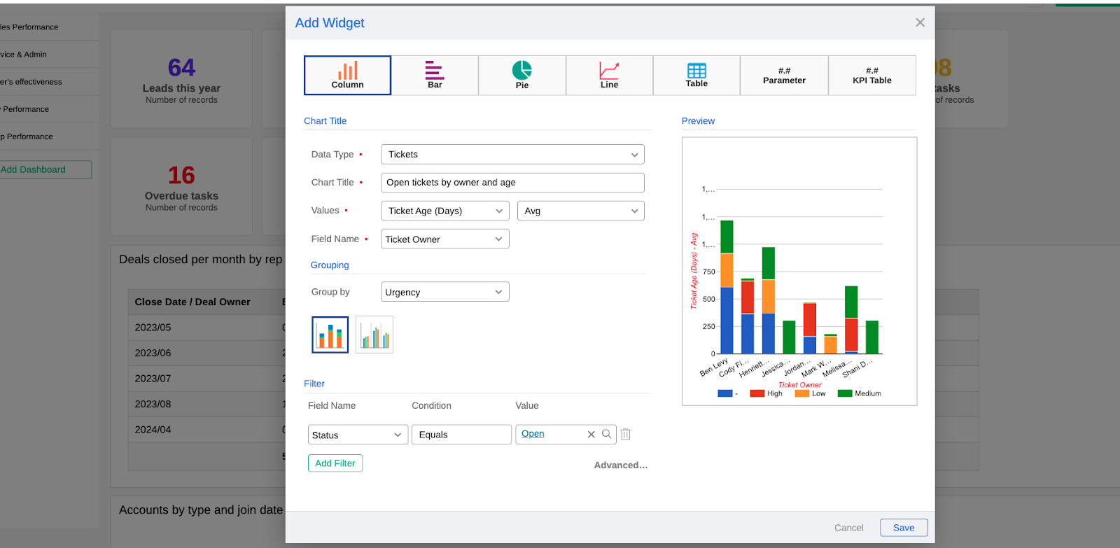
After selecting the Column option, set all the standard fields. As mentioned above, the Values field will set the Y axis and the Field Name field will set the X axis. The Group by option will provide you with two display options: stacked individual columns or multiple columns displayed side by side. Select the display option which you feel better visualizes your data.
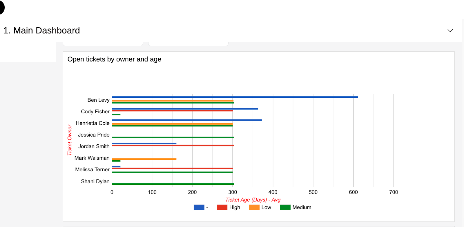
For example, you can create a column widget titled Open tickets by owner and avg age. To display this data, first select the Tickets object from the Data Type dropdown. Next set the Values to Ticket Age (Days) and Avg. Then set the Field Name to the Ticket Owner option. You can even add an extra layer of data using the Group by option, such as selecting the Urgency field here. Finally, add the Status Equals Open filter. Now your column widget displays the average age of all the open tickets in your system, segmented by their owner. It even adds the extra grouping so you can see the urgency of these tickets.
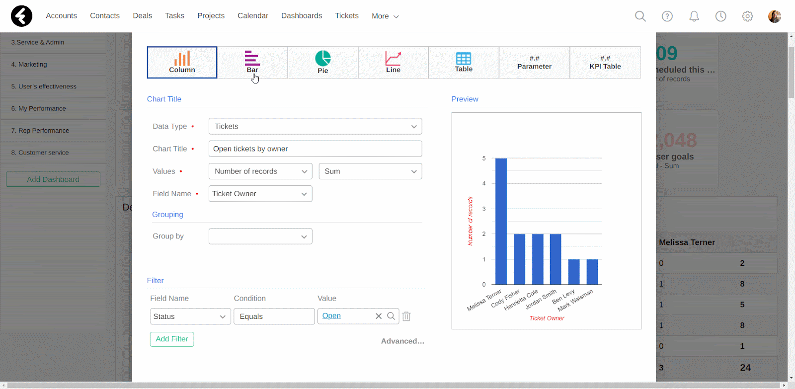
Bar widget
The bar widget is used to organize data in horizontal bars. The X axis will display the selected Values, while the Y axis will show the values of the field selected under Field Name.
When to use
The bar widget is very similar to the column widget, and serves the same purpose. It’s recommended to use the bar widget instead of the column widget when the value names are longer, as it has better readability. Besides this, they are interchangeable and the type can be chosen based on your preferred display.
How to use
You can set up this widget in the same way you’d set up the column widget. The only difference is that now the Values will be displayed on the X axis and the Field Name will be displayed on the Y axis. In the picture below, the Group by display has been set to multiple columns instead of stack columns.
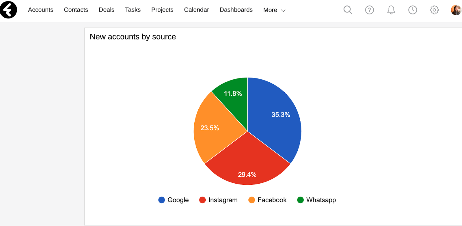
Pie widget
The pie widget organizes your data into different slices within a circle, and is a great way to visualize proportions.
When to use
The pie widget breaks up a whole into pieces. For this reason it should only be used if the sum of the individual parts add up to a meaningful whole. In this way you’ll be able to visualize how each part contributes to that whole. To help distinguish between the different slices, each slice has a different color and hovering over the slice will display their details. You’ll find a color key at the bottom of the widget.
How to use
After selecting the Pie option, set the regular details. The values of the field set in the Field name will set the different slices, while the Values section will set the data included within each slice.
For example, you can create a pie widget titled New accounts by source to understand where your new accounts are coming from. First choose the Accounts object and then set the Values to Number of records and Sum. Next set the Field Name to Lead Source. Make sure to add the Status Equals New filter so that only new accounts are included in your pie chart. You may also want to add the Lead Source Is Not Empty condition to your filter, so that you don’t include accounts which don’t have a lead source set. You can now easily check which of your lead sources are most and least effective.
Line widget
Display how your data progresses over time using line widgets. The X axis will show the values of your selected Field Name, while the Y axis will show the selected Values.
When to use
The most common use for line widgets is when the field you’ve set is a timeframe. In this way you can visualize the way that your data is changing between different time periods. They’re especially useful for identifying smaller changes. By using the Group by option you’ll include multiple lines, where each line represents a different type of data. You can then compare how the different lines of data progressed during the same time period. Each line will be colored differently to help you differentiate between them, and you’ll find a key at the bottom of the widget.
How to use
After selecting the Line option, set the normal fields. The Values will be displayed on the X axis, while the Field Name values will be displayed on the Y axis. The Group by option will segment the data and create an individual line for each group, so that you can easily compare the different groups.
For example, you can create the Account types by join date line widget to see when different types of accounts joined your company. Select the Accounts object and set the Values to Number of records and Sum. Next set the Field Name to Join Date, and in the Grouping Type field that opens set the time frames you’d like as the points on your X axis. For example, select Calendar Month to see how many accounts joined per each month. Your chart will now include a line for each type of account in your system, and you’ll be able to compare how many accounts joined each month for each type of account.
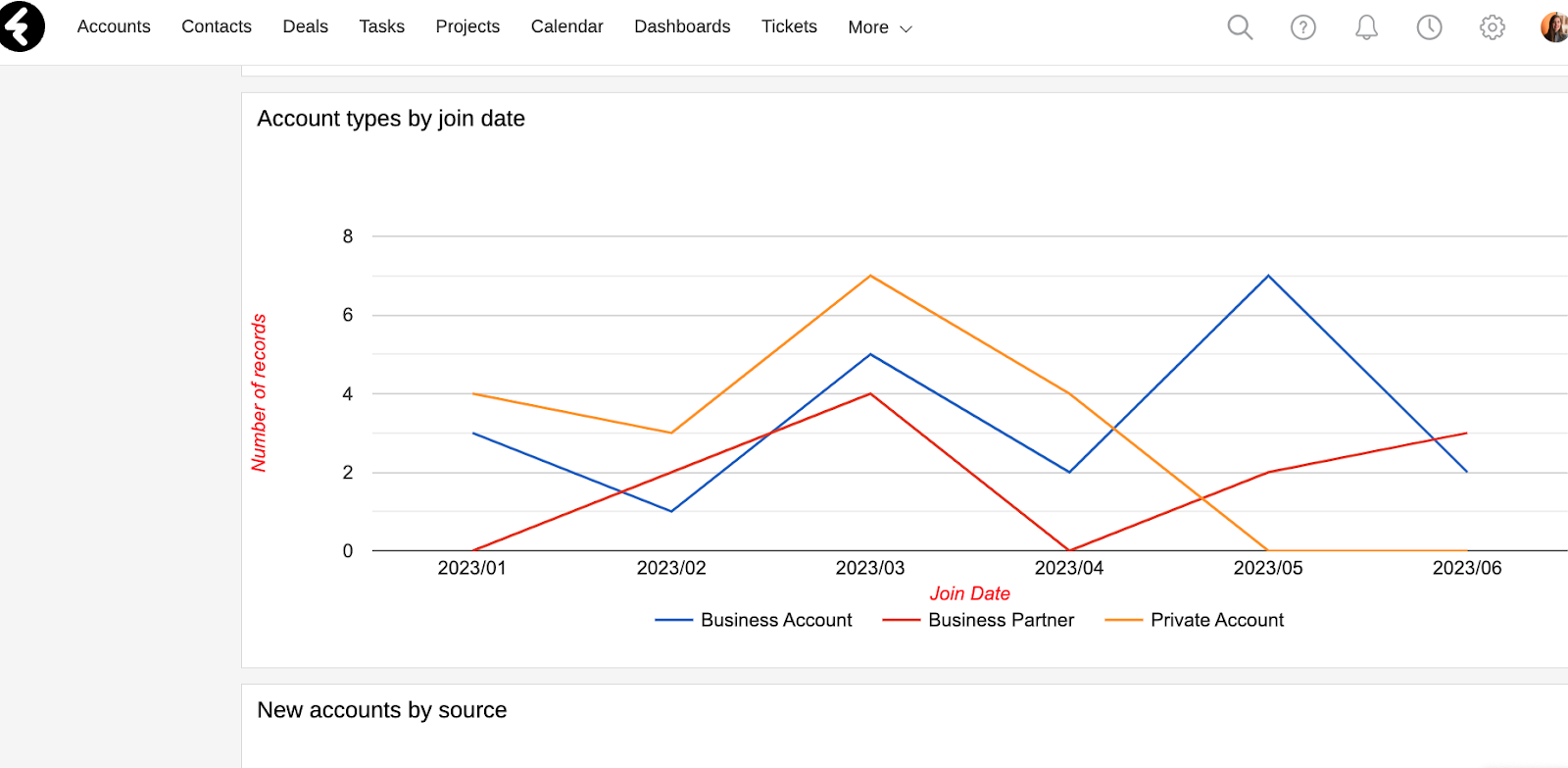
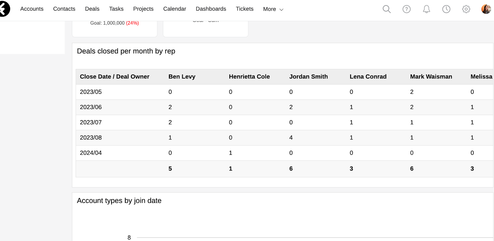
Table widget
Use the table widget to display a single object’s data in columns and rows. It’s a great way to get an overview of lots of different information in one place.
When to use
The table widget is structured for organizing and displaying information, with data arranged in columns and rows. Tables make it easy to compare pairs of related values. Use the table to look up one or more particular values, or if you want to examine a set of quantitative values as a whole.
How to use
After selecting the Table option, set the normal fields. The Values will be displayed as the data in the inner cells of your table. The Field Name will set your row headers, while the Group by option will set your column headers. The last row and column will be displayed in bold and show the cumulative totals of their respective row or column.
For example, you can create a table titled Deals closed per month by rep. After selecting the Deals object, set the Values to Number of records and Sum. You can then set the Field Name to the Close Date field and set the Grouping Type to your desired grouping, such as Week or Calendar Month. Next, be sure to set Group by to the Deal Owner field. You’ve now created a table which displays the amount of deal’s each system user closed per month.
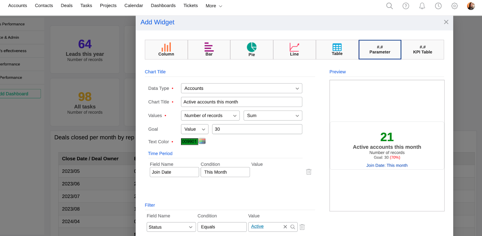
Parameter widget
Use parameters to display and track business goals and KPIs which you’d like to be highlighted. You can even set goals and display the success rate.
When to use
Each parameter widget will display one data point. For example, you can display your active accounts, MMR, ARR, scheduled meetings, and much more. It’s also a great way to set a goal for yourself or others which can be easily tracked. It’s frequently useful to place several different parameter widgets side by side which all belong to the same data type, such as multiple data points which all relate to tasks. You can even set them all to the same color so that they’re easily distinguished as a set.
How to use
After selecting the Parameter option, set the object type and title. The Value you set here will be the data point which your parameter displays. This widget has three additional options which you can use to customize it:
- Goal: Set a goal for your parameter. For example, if you’re making a parameter for new leads this month, you can set the goal to 20. Simply select the Value option in the first box, and then set the second to the number 20.
- Text Color: This will set the color of the number displayed in your parameter. You can click the box icon to select a preset color, or use any HEX color code. You can use colors to group parameters visually by type, or just to make your widgets more distinct.
- Time Period: You can use this section to set a specific time frame. Only records which match the set time frame will be included in the calculated value for the parameter. The functionality of this field works the same way as filters do, which are explained above, except that the Field Name section will only show date and date & time fields.
For example, you may wish to create a parameter called Active accounts this month, so you can track how many accounts have joined this month and are active. Select the Accounts object and then set the Values to Number of records and Sum. You can now set the Goal to 30, so that you’ll see how close you are to completing this goal. Set the Text Color to a color which identifies it. For example, if you use the color green for all your account parameters, set it to green here as well. You can then set the Time Period to Join Date This Month. Be sure to add the Status Equals Active filter so that only active accounts are included. Now your new parameter will display the total number of account records in your system where their status is set to active and their join date is in the current month. You’ll also be able to see that the goal is to get to 30, and the percentage of this goal which has currently been met will be displayed in red.
KPI Table widget
By using the KPI table widget, you’ll be able to create a comprehensive table which displays many different data points and even uses data from multiple different objects.
When to use
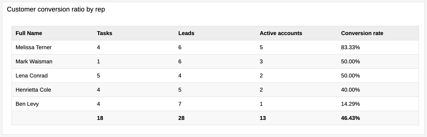
Key Performance Indicators (KPIs) are quantifiable measurements of how your business is performing for a specific objective. By using different KPIs, you can gauge progress and measure success based on specifically set business targets. By using a KPI table you can display multiple parameters in a single table. You can then use these parameters to build formulas and gain insights on performance. For example, you can check the conversion rate of leads to active accounts based on the account manager. Creating a space where you can track your business’s KPI statuses will help your business stay focused and accomplish its goals.
How to use
As the KPI table is a more complex widget, its explanation is more in depth than the other widgets. You can find an explanation on how to set up KPI tables here.