Getting started with dashboards
What are dashboards?
Fireberry dashboards allow you to create spaces where you can get an overview and analysis of your data. For example, you can create a sales dashboard which shows you data points about your sales like the total revenue of your sales, the conversion rates of your reps’ leads, your accounts by ownership, and so much more.

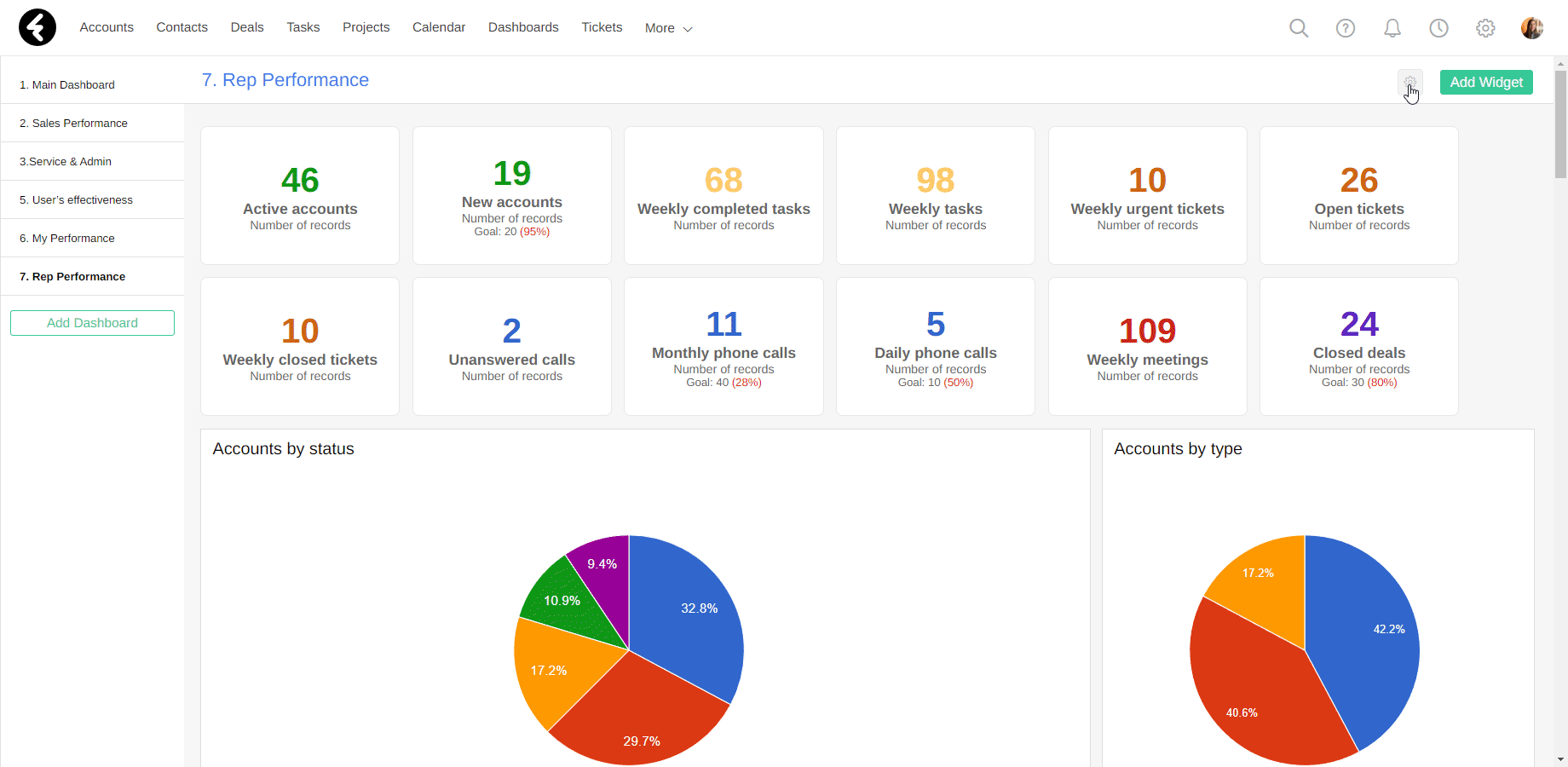
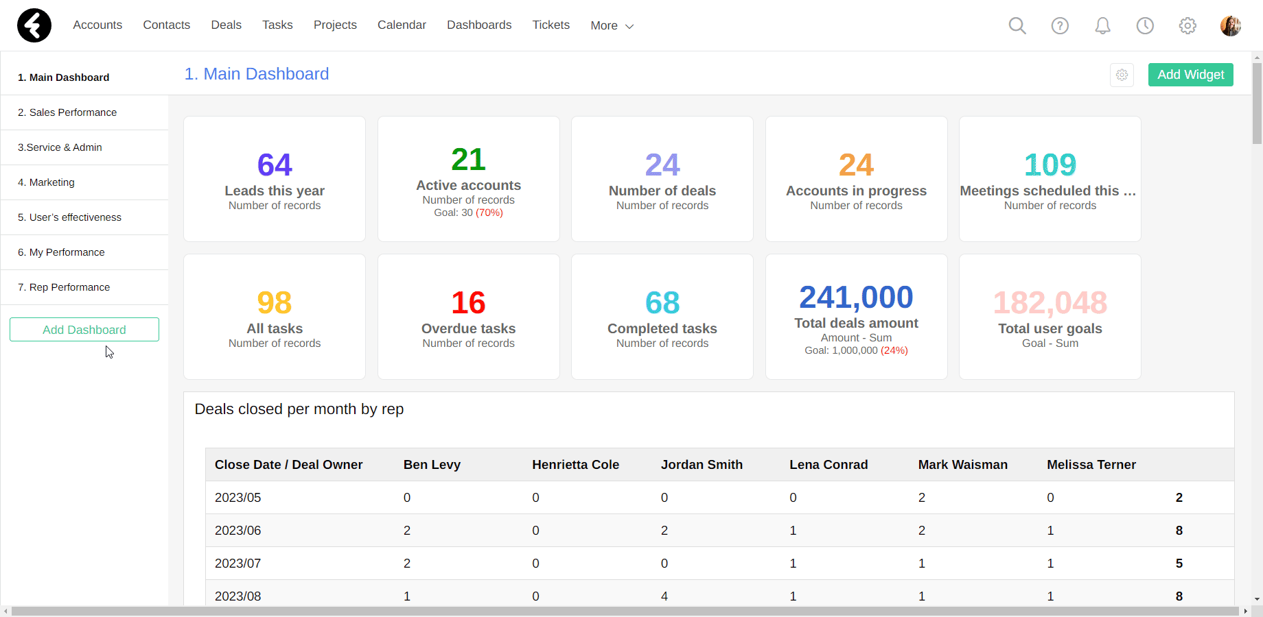
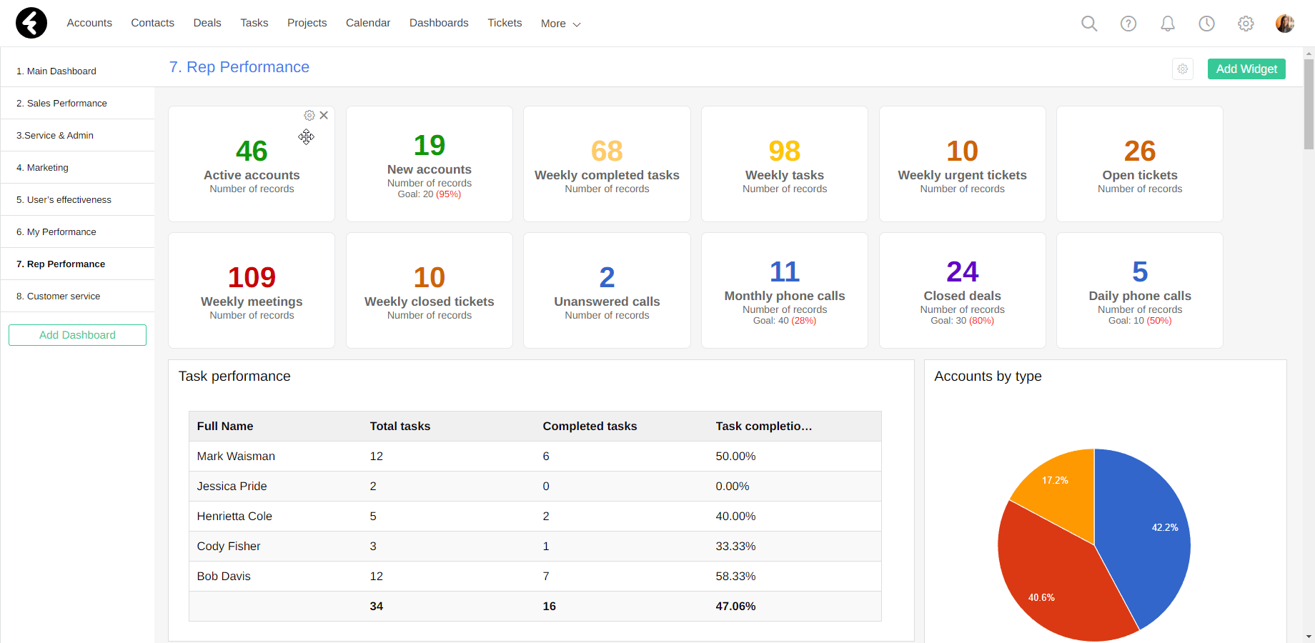
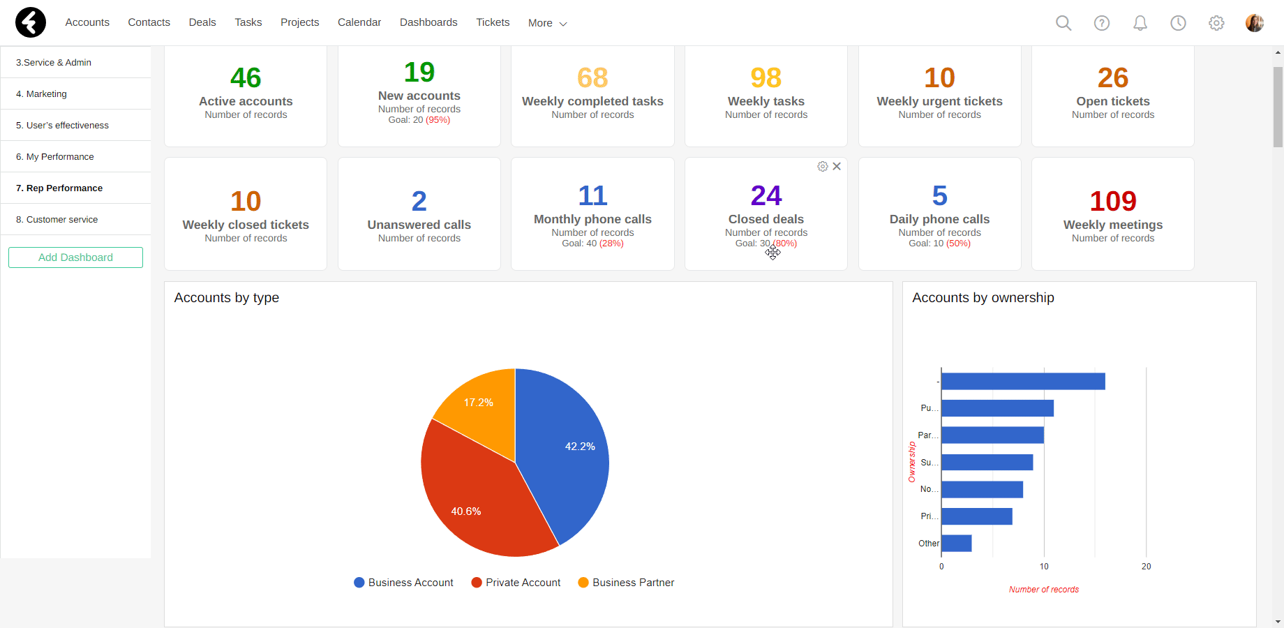
Dashboards are made up of widgets, where each data point in a dashboard is displayed using a widget. For example, in the image above each titled section is a different widget. There are many different widget types which you can build to display your data, like pie charts, graphs. Table, and more. You can learn about the different widget types and how to use them here.
To open your dashboards, simply click the Dashboard option from the top-bar menu. If you don’t see this option, search for “Dashboards” under the More dropdown list. Once you’ve opened your dashboards, you’ll find a sidebar on the left with all the dashboards you have access to. By clicking on any of these dashboards, they’ll open on your screen. There are a few default dashboards which come with the system. You can choose to edit the settings and widgets of the existing dashboards or create your own; both options are explained below.
Dashboard settings
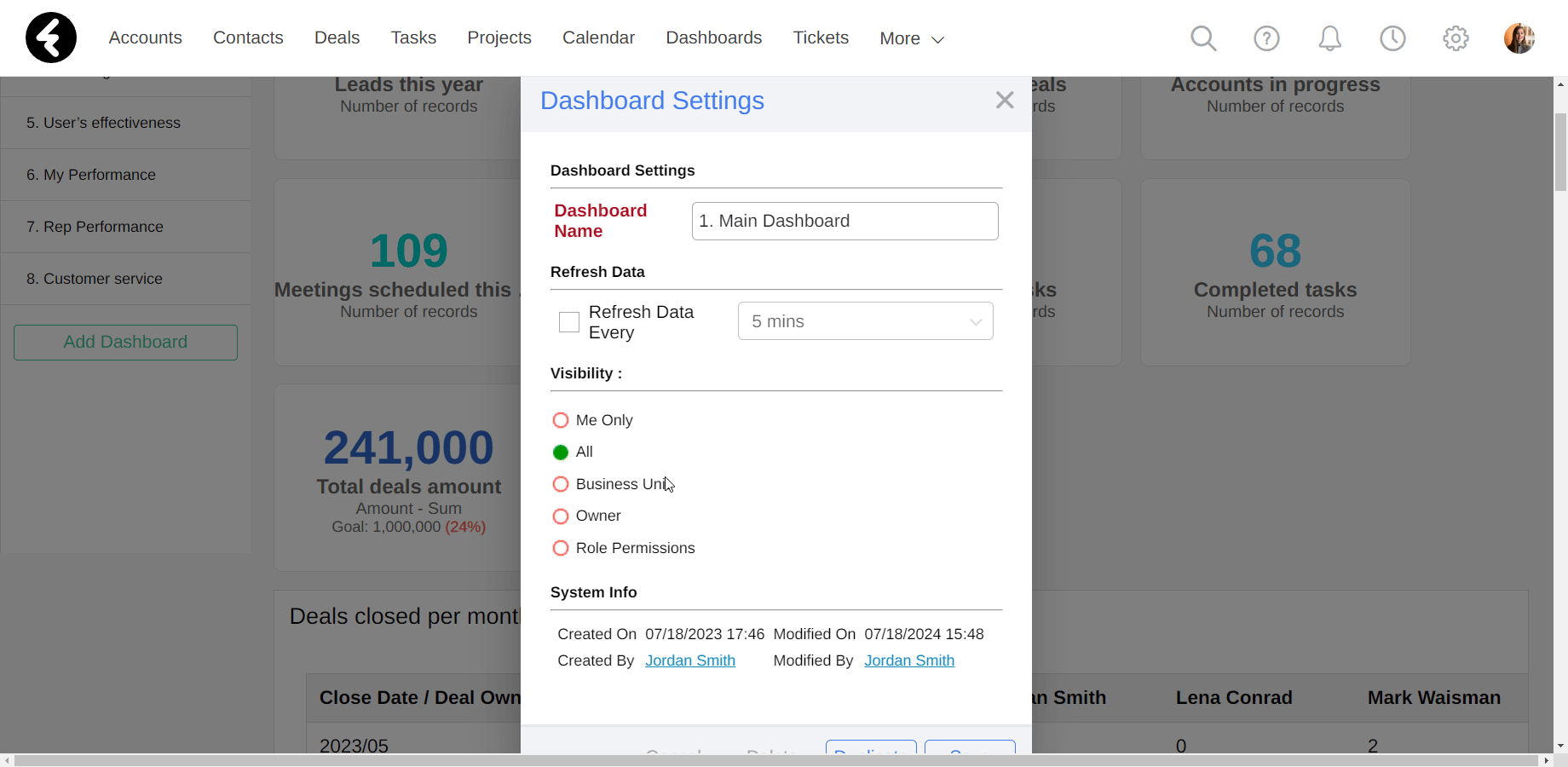
Once you’ve opened a specific dashboard, you can start making changes. On the top right you can click on the gear icon. This will open the Dashboard Settings pop up, where you can make the following changes:
- Dashboard Name: Here you can change the name of your dashboard. The name of your dashboard will set where it appears in the sidebar, and works the same way as the order of the views sidebar. You can learn about the order settings here.
- Refresh Data: By checking the box here, you can set your dashboard to refresh every set amount of time, so that your data stays up to date. After clicking the box, select the timeframe of how often you’d like your data to refresh. If you don’t select this option, your data will refresh whenever you open or refresh the page.
- Visibility: This will set which users have access to this dashboard, see below.
- System Info: Here you’ll find info on when your dashboard was created, by who, and when and by who it was last modified. The creator of the dashboard will be the owner who is used to set permissions, as is explained below.
- Cancel: This will cancel any changes you’ve made in the settings and close the settings.
- Delete: Click this button, and then click OK in the pop up to delete the dashboard.
- Duplicate: This will duplicate the current dashboard, including the visibility settings and all the widgets and widget settings within it. The name of your newly created dashboard will be the name of the original dashboard preceded by the word “Copy”.
- Save: This will save any changes you’ve made within the settings. If you don’t click this button, none of your changes will be saved or applied.
Creating new dashboards
To create a new dashboard, click the Add Dashboard button at the bottom of the dashboard sidebar. Next, set the name of your dashboard to a name which represents its purpose. Additionally, the name will set the placement of this dashboard within the sidebar, see the explanation on the views sidebar here for more details. You can then set the Visibility options for this dashboard to set which users will be able to see it; see below for how the different options here work. Finally, choose the layout you’d like to use for your new dashboard under the Dashboard Pattern section. This will set how many columns your dashboard has, as well as the width of the columns. By clicking Save you’ll create your new dashboard. You can now customize your dashboard by adding different widgets, which is explained below.
Dashboard visibility
Both within the settings and when creating new dashboards, you can set the visibility of your dashboard. This will control which users have access to your dashboard and are able to see and open it. There are five different options, which can be split into two categories. Each option can be selected by clicking the circle next to it.
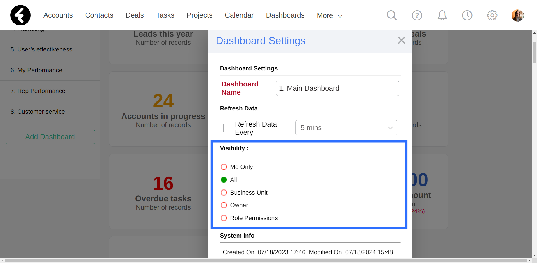
Basic visibility options
You can set up either of the first two by simply checking the circle next to them and clicking Save. These are the following options:
- Me Only: Only the creator of the dashboard can see this dashboard.
- All: Everyone in your organization can see this dashboard.
Advanced visibility options
The next three options have two steps. You’ll first choose the level by which you’d like to set the visibility access. The options are:
- Business Unit: You’ll be able to select which business units can see this dashboard, such as only the North Branch. You can learn more about business units here.
- Owner: You’ll be able to select which system users can see this dashboard, such as specifically Melissa Terner and Bob Mccain.
- Role Permissions: You’ll be able to select which user roles can see this dashboard, such as Sales Reps and Sales Managers. You can learn more about user roles here.
Once you’ve selected any of these three options, a picklist field will open to the right of the selected option. First, click the looking glass icon. This will open a pop up where you can set who will see this dashboard. On the left you’ll see a list of all the business units, owners, or roles which exist in the system. By clicking on them, you’ll add them to the list on the right. This list is the list of your selected options who will be able to see this dashboard. You can remove options from this list by clicking on them.
For example, you can select the Role Permissions option, and in the pop up you can click on the Sales Reps and Sales Managers roles. Be sure to click Ok once you’re done selecting, and then save your dashboard’s settings. Now only users who are assigned to these roles will be able to see this dashboard.
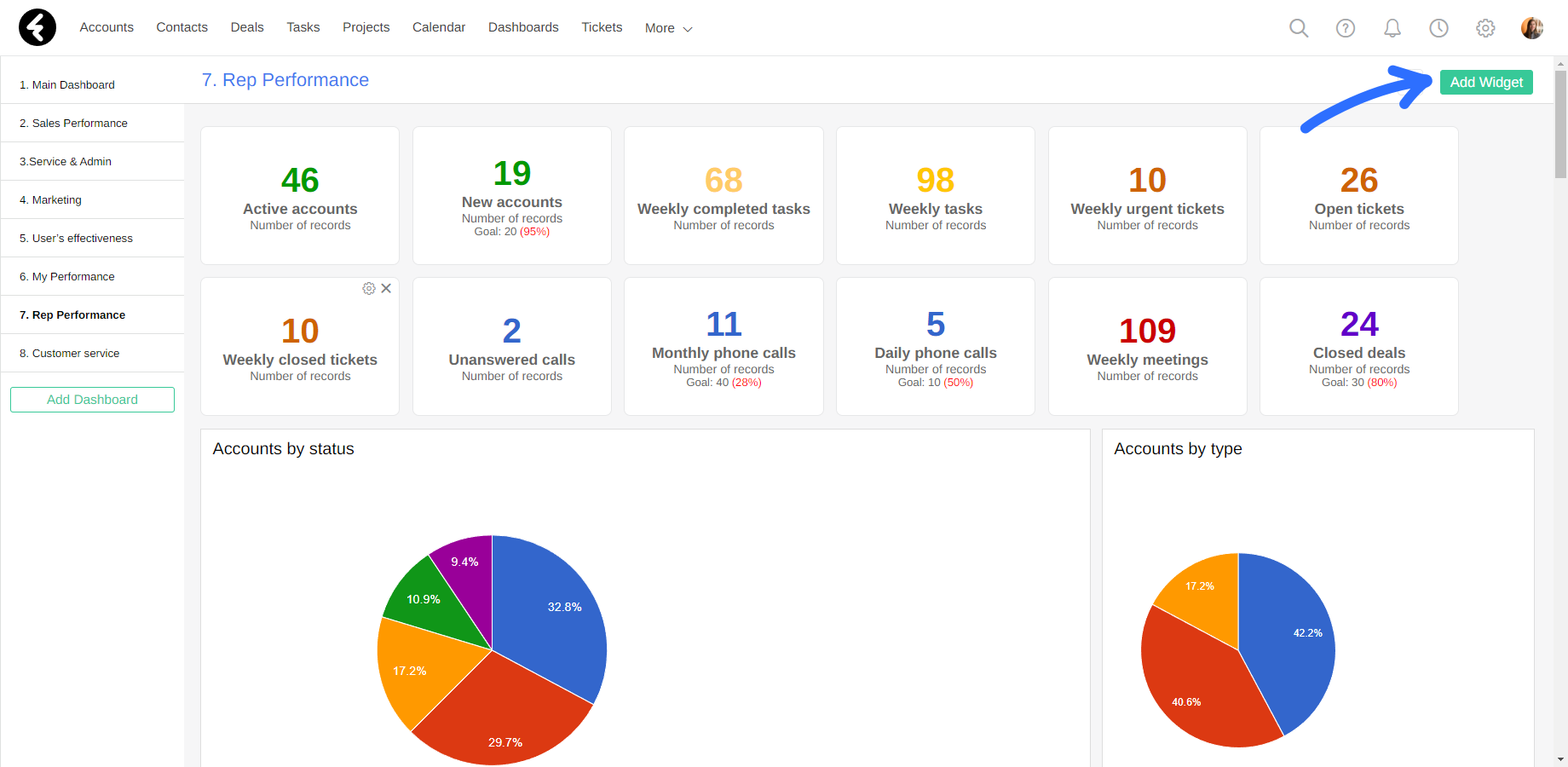
Working with widgets
Each dashboard is made up of different widgets, such as parameters, tables, pie charts, and more. To add a new widget, simply click the green Add Widget button at the top of your dashboard. This will open a pop up where you’ll first select the type of widget you’d like to create and then set its settings. It’s important to use the relevant widget type to best display your data; you can learn about each specific widget type and how to set it up here.
Widget options
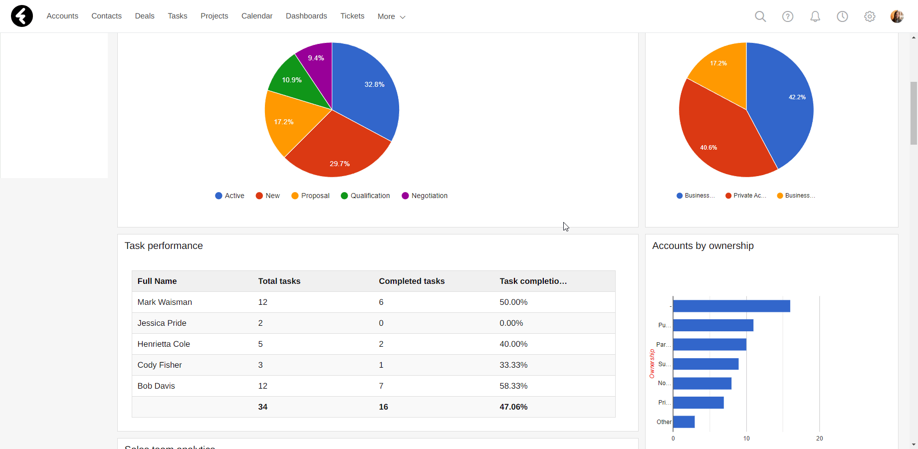
By hovering over a widget, you’ll find three different options on the top right corner:
- Export to excel: By clicking on the first option, you’ll export the data in your widget into an excel document, which will be automatically downloaded to your computer under the name of the widget. This option does not exist for the Parameter widget type.
- Settings gear: This will open the settings of the widget, so you can update it. Learn more about these settings here.
- X: Clicking the X will open a pop up asking if you’d like to delete this widget. By selecting Ok your widget will be deleted.
Moving widgets
You can also move the position of a widget at any time by dragging it to a new location in your dashboard. The columns which set where you can put widgets will be based on the option you selected in the Dashboard Pattern section when creating your widget, and cannot be changed once your dashboard has been created.
Opening views from widgets
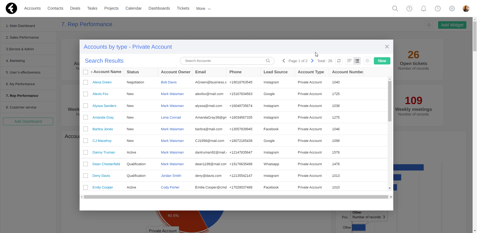
By clicking on a widget, or sometimes on a specific data point within a widget, you can open a view of the records which are being displayed by this widget. For example, by clicking on a parameter widget you’ll open a list view of all the records which are being counted in the total displayed by the widget. When clicking on the different slices within a pie widget, you’ll open a view of the records which belong to that slice of pie. You can click on different sections within each widget type to open lists of the records being represented.
After opening these views, you can work with the records within them. Clicking on a record will bring you to the page of that individual record. You can also use the search bar at the top to find a specific record. The number of pages will be displayed next to the search bar. If you've opened a long list with more than one page, click the arrows on the right and left to navigate between the pages. You can even click on the settings gear here to open a list of different options:
- Export to Excel: This will export your current list of records as an excel file.
- Merge records: You can select two records using the checkboxes on the left and then use this option to merge them into one record.
- Change Field: This allows you to bulk edit fields, learn about bulk edit here.
- Records Allocation: Clicking this will bring you to the Records Allocation page, you can learn more here.
- Edit View: Click this to open your view’s settings and edit them. Learn about view settings here.