Page components
Page components allow you to individualize and customize your page layouts so you can easily and efficiently display all the information you need. This article explains how to define and use the various page components.
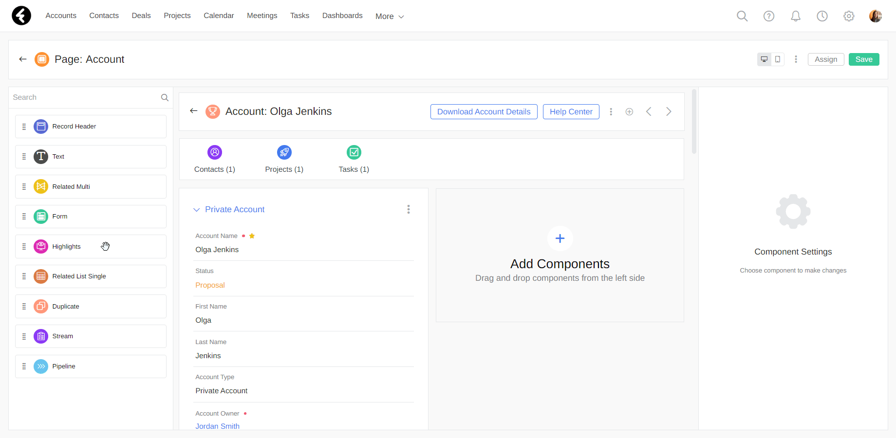
You can find a list of all the page components on the left side of each page layout editor. To learn how to create or access existing page layouts, please see the following article.
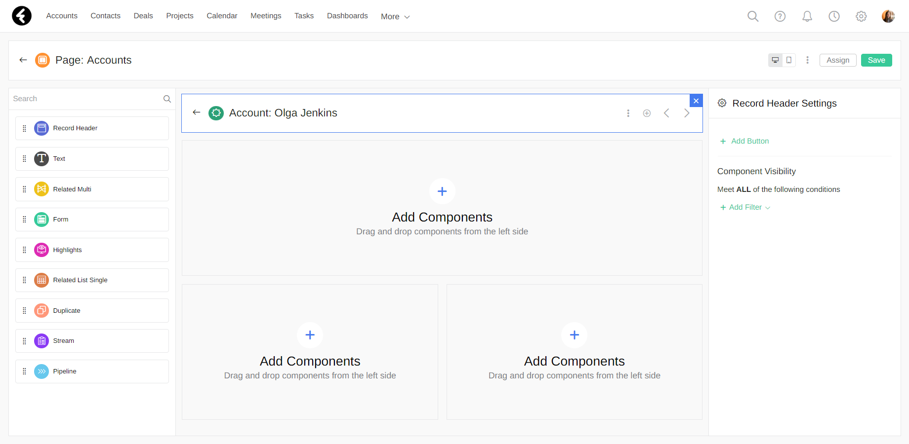
To start, open the page layout editor of the page you’d like to edit. You can now add as many or as few components as you wish to each part of your page. To add a component to your page, simply drag it from the components list to the desired location. You can change the location of existing components using drag and drop. By default, each object’s page will contain the record header, related multi, form, and stream components. The Accounts and Contacts objects will also automatically include the duplicate component.
In this article each component will be explained using the Accounts object page layout, but you can set up a page layout for any system object.
Record Header
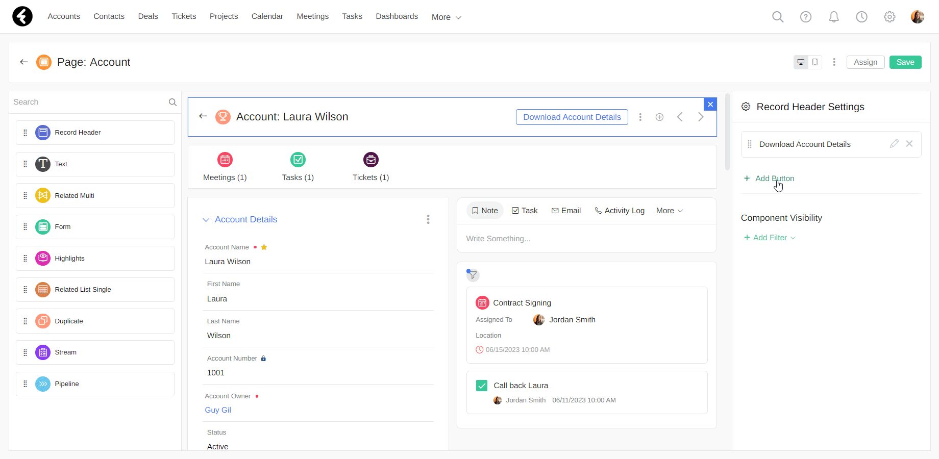
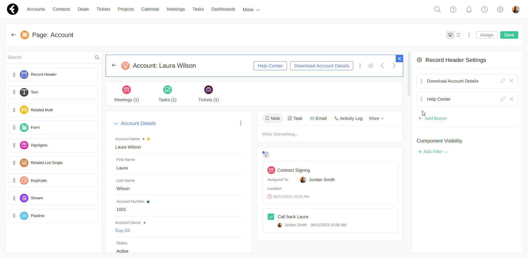
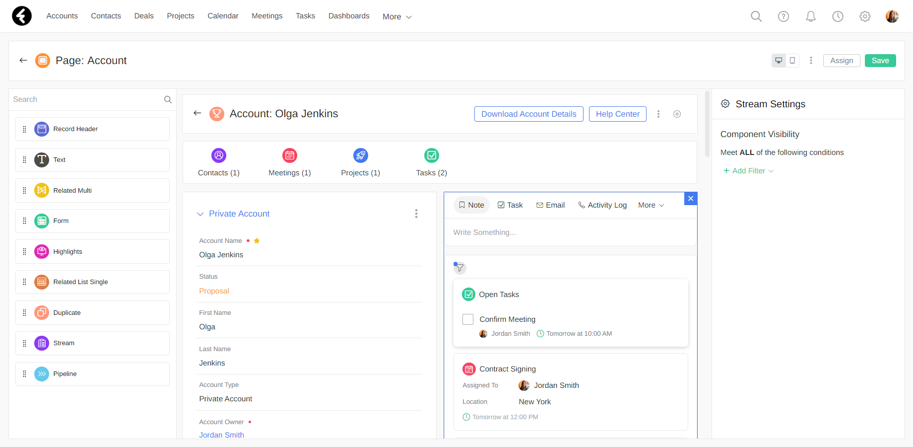
Record Header consists of both the object name and the record name. Using the Accounts object example, the header will display the following text: "Account: Olga Jenkins". To add the Record Header element to the page, drag it to the desired location.
Buttons
Buttons are completely customizable and are a great way to work efficiently by including helpful links within an object’s record header. The functionality of buttons works using HTML or JavaScript code. Thus we recommend having someone with moderate coding abilities set them up.
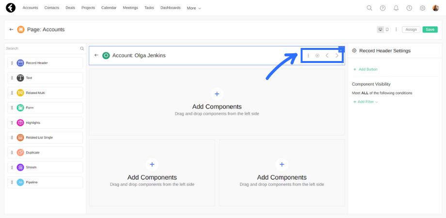
You can add a button using the record header settings on the right of the page. Simply click Add Button to open a dialog button where you can set your new button’s capabilities.
Next set the buttons fields:
- Button Name: This name will be displayed on the record header.
- HTML: Custom HTML or JavaScript code.
- Width/Height: Set the size of the button.
To save your new button, click Save.
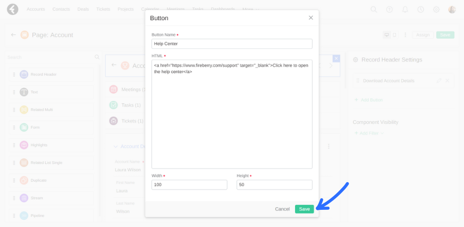
If you want to change the order of the displayed buttons, simply drag and drop them. To edit an existing button, click the pencil icon on its right. If you would like to delete a button, click the X. You will then need to type DELETE into the pop up.
Text
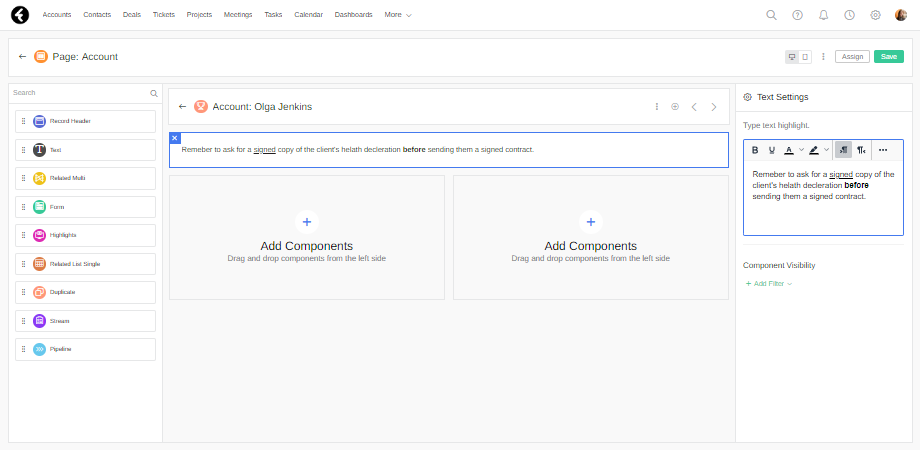
The text component displays a text box with any text you would like your system users to see. Type your desired text into the Text Settings dialog box on the right of the page. You can format your text using bold, highlight, underline, and more. For example, you can add a Text component which displays the following text: "Remember to ask for a signed copy of the client's health declaration before sending them a signed contract."
Related Multi
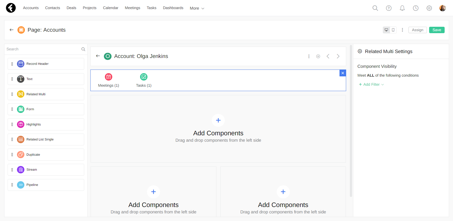
The Related Multi component presents access to all the records related to the current record. For example, clicking the Meetings object will display all the meetings related to the current record.
The number in the parentheses beneath each object shows the total number of related records, so you can easily see how many Tasks, Meetings, etc. are related to the record.
Form
This component displays a form with the fields and values of a record. You can set sections for the fields, which fields to display, the format they are displayed in, and more. A standard form contains important information, such as a name, phone number, status, and more.
.png)
Forms are complex components which include sections and fields. To learn about adding and editing forms and sections, see our forms, sections, and fields article.
Once your form and sections are set up, you can add fields to your sections. Learn about adding fields here.
If you would like to set the visibility of a form, section, or field, check out our conditional visibility article.
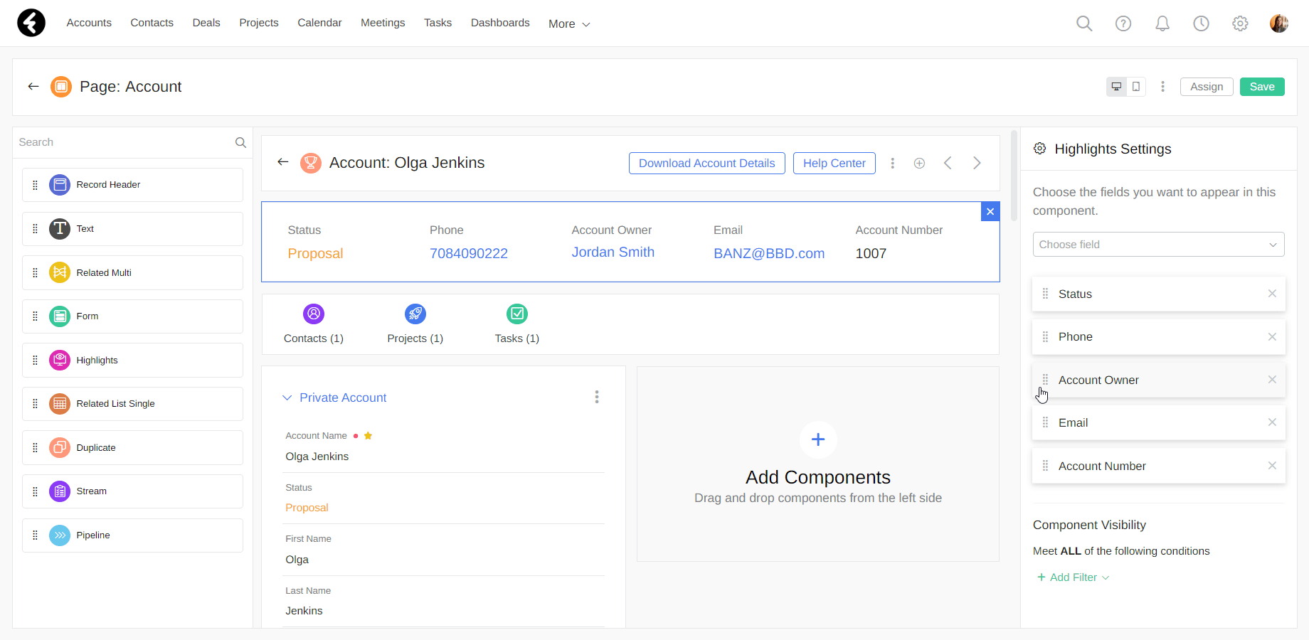
Highlights
The Highlights component creates a section where you can easily access frequently used fields.
To use Highlights, you need to define which fields you would like to access. To do so, follow these steps. First, drag the component to the desired location in the layout. On the right, a settings panel will appear where you can define the component's settings. Under the Choose field dropdown list, select all the fields you want to display in your new section. For example, the Accounts object lets you add fields such as Status, Phone, Account Owner, and more.
You can define the order in which fields appear in the Highlights component simply by dragging the fields. The field at the top will appear as the leftmost field.
This component allows you to organize your information in a convenient and efficient way, and helps you save time when searching for fields.
Related List Single
Using Related List Single, you can conveniently display information from records related to the record you're in.
For example, within the Accounts object you can run Related List Single on the Task object. First drag the component to the desired location, and then use the Component Settings panel on the right to select the Task object.
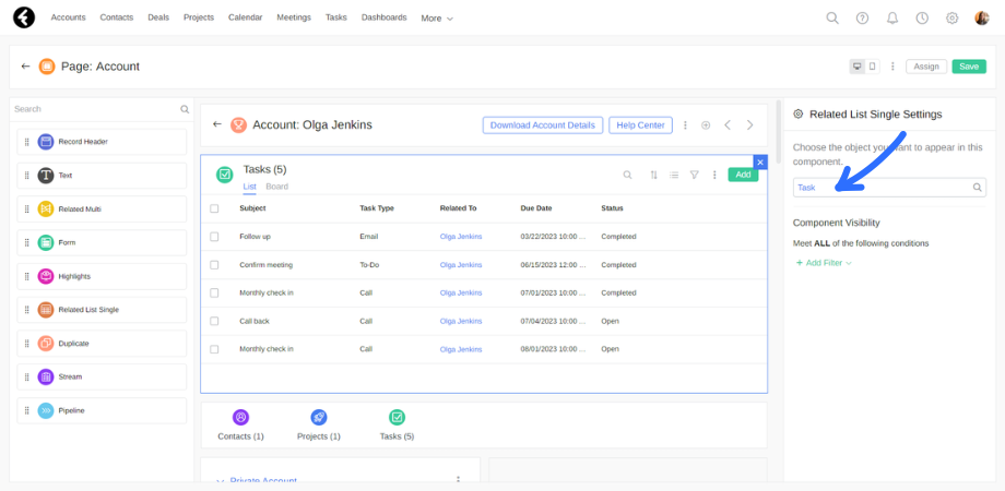
By entering one of the accounts, you can view all the tasks related to that account in a list, along with all the relevant details, such as the task owner, end date, status, etc. As a result, you can easily track all the related tasks and ensure they are completed on time.
Duplicate
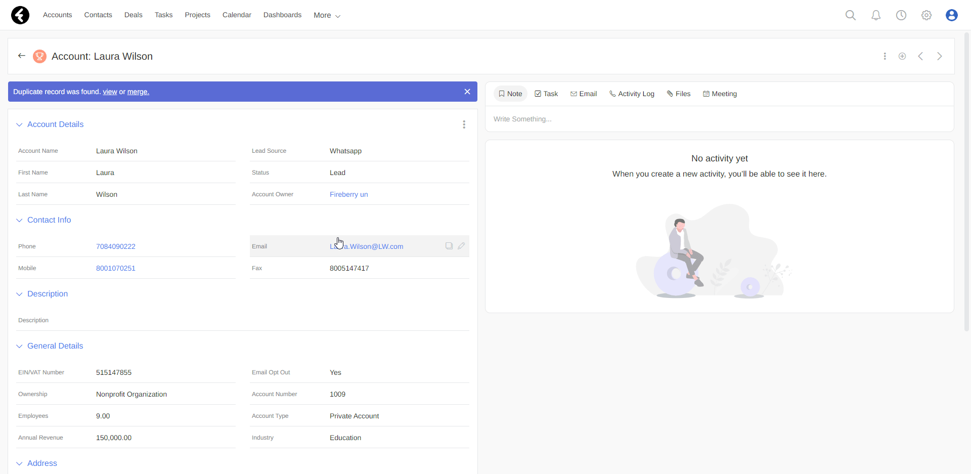
The Duplicate component lets you set up an alert which you’ll receive if two or more records in an object have duplicate values. You can choose which field or fields will be checked for duplicates. If a record contains duplicate values, the duplicate component will be displayed and allow you to view the records which contain duplicate values. You can even choose to merge them into a single record.
To add Duplicate to your page, drag it to the desired location, and then use the Duplicate Settings panel on the right to choose fields. For example, within the Accounts object you can choose to receive duplicate alerts on the Email and Mobile fields.
Now account records containing identical Mobile or Email field values will display a purple duplicate indicator bar.
You can select and check the following field types for duplicate records using this component: Text, Text Area, Phone, Email, and URL. You can also select a Formula field, explained here, where the result is one of the above listed types. You will not be able to select or check the following field types: Picklist, HTML, Number, Date, Date & Time, and Summary.
After adding the duplicate component to your page editor, there are three different options of what may be displayed:
- Invalid Settings: This will appear if you have not yet selected at least one field to check for duplicates. You will not be able to save your page until you add a field or remove the duplicate component.
- No Data: This means the record you’re currently viewing does not have any duplicate information within the selected fields. Your component is properly set up, and once you save your page this component will not be displayed for the current record because it doesn’t have any duplicates.
- Duplicate records were found: A purple bar will show indicating that duplicate records were found. This is how the component will appear on your page if there are duplicate records.
After saving your page, you’ll see the purple duplicate component if duplicate records were found. By clicking on View you can view the potential duplicate records, and by clicking on Merge you can merge them. Merge combines two records at a time, and allows you to choose which fields to include from each duplicate record.
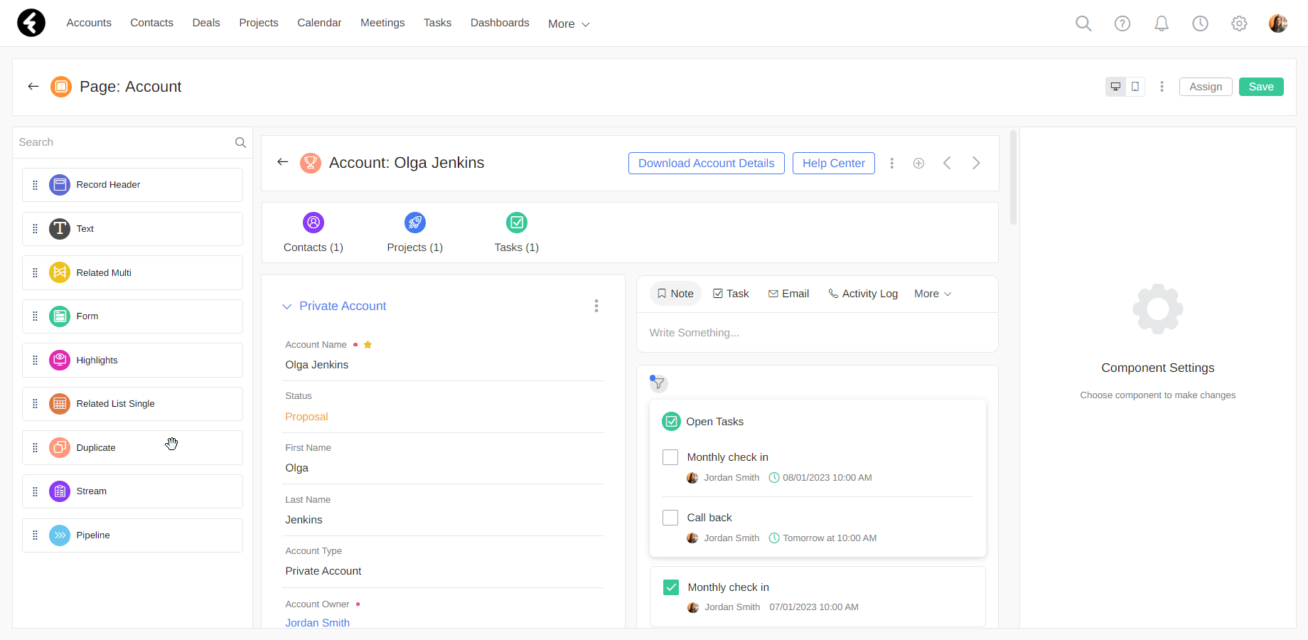
Stream
Using Stream, you can very quickly perform a variety of actions and view the history of each action. The record Stream contains various options such as creating a note, task, or meeting, uploading a file, sending an email, and more. For a detailed explanation of the actions that can be performed through the Stream, see the following article.
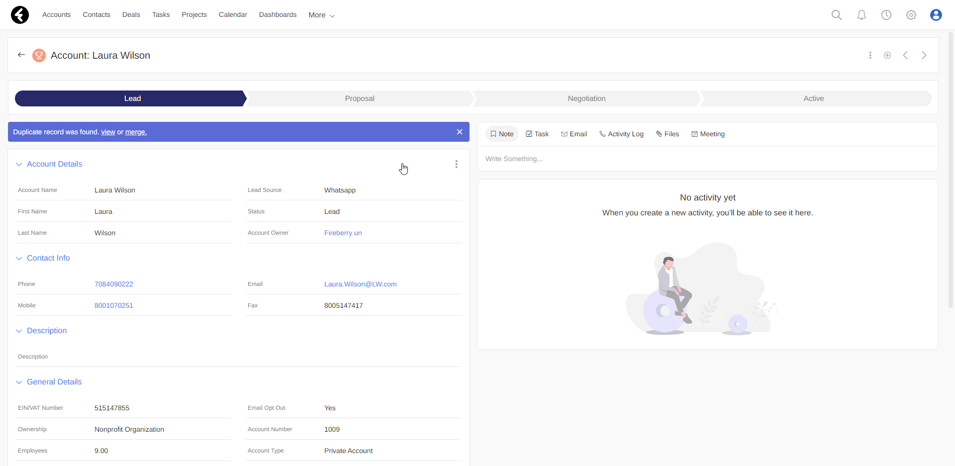
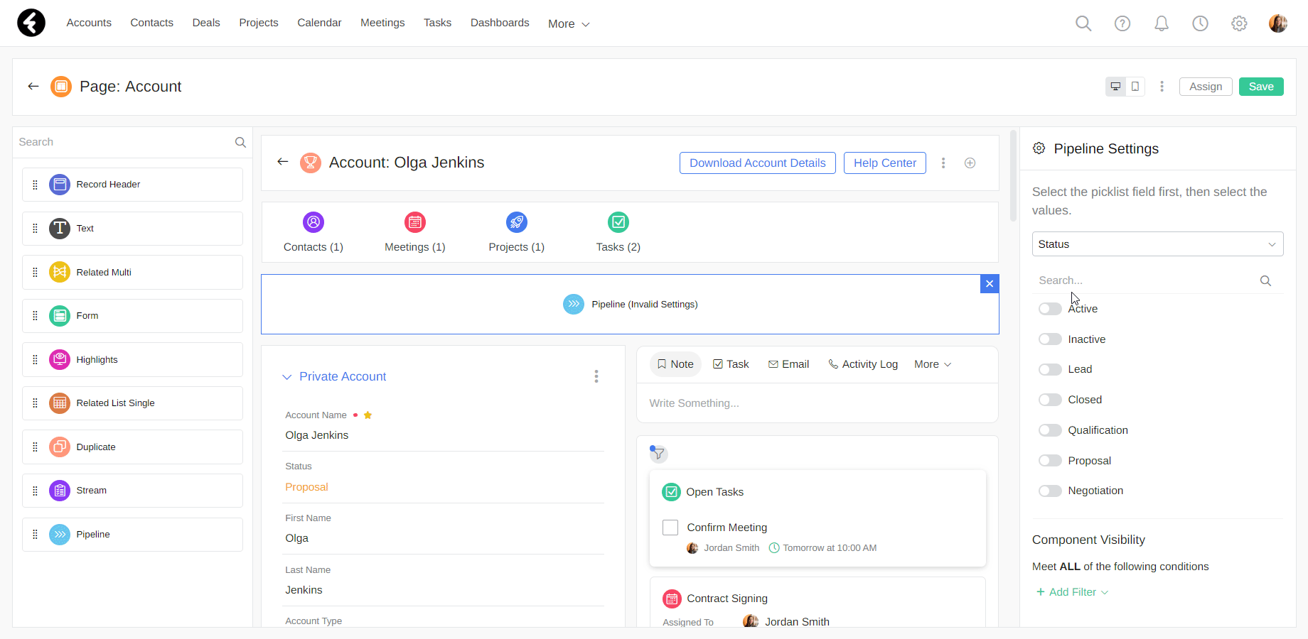
Pipeline
Using the Pipeline component you can easily see which stage a record is in and get a clear view of how it is progressing.
To add a Pipeline, first drag it to your desired location. Once you place it, use the Component Settings panel on the right to set the relevant field and values. For example, within the Accounts object you can choose to display the Status field as your Pipeline and set the progress line as the values Lead, Proposal, Negotiation, and Active.
To choose the field values you would like to use, simply search and add the values using the toggle button. To change the progress line order, drag and drop the values; The first value will be the leftmost.
Using the Pipeline, you can optimally manage your records by easily visualizing their status.
When on a record card, you can use the Pipeline to easily switch between values. For example, clicking on the Proposal section of a status pipeline will change the account’s status to proposal.